Tones
Using tones is one of the easier ways to make your logo attractive while keeping a simple modern look. All you have to do is decide on a color scheme based on what your logo stands for and choose 2 or more variation on a single color. In the example below, we have the fictional company AirThread. I chose blue as the main color and used a dark and light variant to create an understated look.
Using tones is one of the easier ways to make your logo attractive while keeping a simple modern look. All you have to do is decide on a color scheme based on what your logo stands for and choose 2 or more variation on a single color. In the example below, we have the fictional company AirThread. I chose blue as the main color and used a dark and light variant to create an understated look.
Using tones is made even easier by the swatch libraries available in Adobe Illustrator. You can pick a collection of colors that go well together and just click around until it looks right. For this example I used the “Cool” color palette.

Gradients
You can use gradients in a number of ways on your logo design depending on whether you’re using Illustrator or Photoshop. When using Illustrator, the gradient mesh tool is the best way to go. That simple tool gives you a lot of options for getting your logo the way you want it. Let’s take a closer look:
First you lay out your text and images:

Then you choose the gradient mesh tool:

That will create an arrow that will allow out to add points to the object you click, creating a mesh around the shape that looks like this:
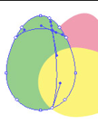
You can click as many times as you want to add as many different colors as you want but to make something look round you really only need 2 to 4. Decide whether you want to cast your light from the left or the right then place your highlights and shadows accordingly to give your object dept. Using lighter or darker shades of your main color will make your end product more realistic than using just grey and white. In our finished product, you can see that the eggs are a little shiny because we added one area of dark and one area of light to each.

While making logos is easier in Illustrator, mostly because they are vectors that can be sized at will, gradient treated logos are better in Photoshop. Again we’ll start with our text:

And instead of using the standard gradient tool in Photoshop, we’re going to use the “FX” button on your layers tab (note if you have a version of Photoshop earlier than CS2 you won’t have this button). That button will bring up this screen:
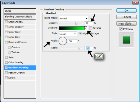
Gradient Effects
You choose how much transparency you want in the “Opacity” field, what colors you want from the “Gradient” drop down, which direction you want the gradient to slant in the “Angle” box and how big or how small you want the gradient to appear on your objects or letters from the “Scale” bar. Selecting the above options and adding a black background gave me this:

Not super high tech but it accomplishes the feel I was going for. The reason Photoshop is better in this arena is that handy little window. You can edit and change and tweak without really altering your image, the whole thing is an overlay so if you wanted to retype your wording or change you logo from a oval to a triangle, you wouldn’t have to start again from scratch.
Shadows
Shadows can be more than just drop shadows, they can also serve as reflections. For the next example, we’ll start with our Ghosteck logo and add a little bit of a shadow to show how something small can take a good logo to better.
Shadows can be more than just drop shadows, they can also serve as reflections. For the next example, we’ll start with our Ghosteck logo and add a little bit of a shadow to show how something small can take a good logo to better.
The first thing you need to do is make a copy of your layer then turn it upside down and flip it so it’s a mirror image. Then you fade it. Basically I reversed all the settings I had in that handy window then tweaked it till I thought it looked right.
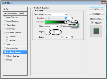
And that gave me this…

Glow
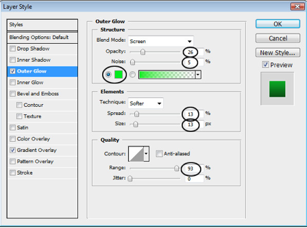
Glow can do a lot of things and is considered a lighting effect. Basically what it does is create an edge around your object or text that softly disperses color. You can control the color, how far from your object it goes out and whether or not the cloud is smooth or looks like static. For this example I went with a smooth glow for a semi haunting look.
Glow can do a lot of things and is considered a lighting effect. Basically what it does is create an edge around your object or text that softly disperses color. You can control the color, how far from your object it goes out and whether or not the cloud is smooth or looks like static. For this example I went with a smooth glow for a semi haunting look.

Accomplishing this look was easy, again the handy “FX” window helped me choose the right glow settings to make Ghosteck a little less plain. I just moved the sliders bask and forth until I found a medium I could be happy with.
There is one caution though; too many effects will have people staring at your logo for the wrong reason. Subtlety and moderation are the key in making a dressed up logo look effortlessly powerful.
Paul Adrian Gonzalez writes for Impact Logos, Australia’s premiere logo design company. Visit Paul’s little nook to learn more how to create a high-impact business logo for your startup company.

No comments:
Post a Comment